Argelfraster
Well-Known Member
And Photobucket?
EDIT: Page break
EDIT: Page break
Hyrule Market was the only skin worth using though. All others were terrible in comparison.bentomo said:I would prefer a choice between themes in your personal preferences. I'd like black and orange. Nintnendo did this on their forums when it was still up. There were various themes like zelda or mario (usually each represented 2 different colors with sometimes pictures in the background)
I like black and orange though.
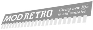
I don't get why the chip is our symbol at all. If anything, it'd be a horrible mess of hot glue and ABS. I much prefer Beta's submission, something more professional-like. If we're aiming to be taken seriously as a modding/review site, the minimalistic/simple way is probably the way to go.XCVG said:I really think there should be some parameters. The chip is kind of our symbol. Also, what about the slogan? Right now it's "Giving new life to old consoles" but I think the "Why reinvent the wheel, just improve it!" one is better.

One of the best in this thread, by far.βeta said:
this is my favorite one.The Question said:http://s1014.photobucket.com/albums/af266/The_Questionz/?action=view¤t=scanned1-1710.jpg
Doodle from when I was bored, I hope nobody votes for this.

its way big and square. needs to be rectangular. make the consoles semi-transparent and put em behind the word, maybe.QuickSkope said:Here one of mine, il finish a few others (with just the logo) but this one is kinda cool.
[image]
Not my best work, but if people like it, il redo it better.