In case you've begun to question it, YES, THE STORE IS STILL UNDER ACTIVE DEVELOPMENT!
You know what it needs though?
A logo.
So why not give us a hand?
YOU HAVE UNTIL August 10th TO DELIVER YOUR BEST WORK TO SERVE AS THE LOGO FOR THE MODRETRO STORE!
And yes, there's a prize.
Well, of course, the winner's logo will be used as the ModRetro Store logo, and that's nice?
But, the winner will also receive a $20 ModRetro Gift Certificate for use when the store goes live!
Simple as that!
The important bit, RULES AND GUIDELINES! READ THIS BEFORE YOU ENTER
1) No Vulgarity or Pornography. I know, "The *Can'tSayThisOnTV*ing ModRetro Store!" has a nice ring, and would probably go well with some giant tits in the background, but no, seriously, none of that.
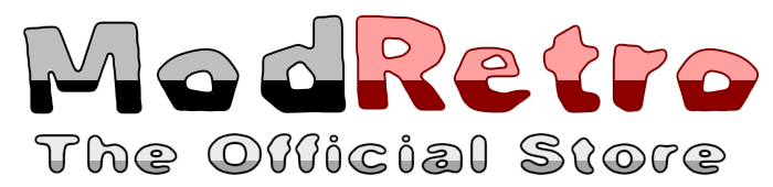
2) Text! The logo is TEXT BASED! That is to say, the FOCUS of your logo should be the words!
3) In that same regard, you are something limited to ANY COMBINATION of these words: "The", "Official", "ModRetro", "Store". You do not HAVE to use all of these, or in that order. These are simply the 4 words you are allowed to use in any place in your logo submission. NO other text is permitted.
4) COLORS! We have a Palette! And those of you who've already checked out the store recently know it's a ways off from the forum! The colors available to you include: #000000,#F0F0F0,#E66771,#960018,#C5C5C5
5) TRANSPARENT BACKGROUNDS! Please, please, please! Make sure your logo has a transparent background!
6)Please, make your logo no less than 500px Wide, or 150px in Height! This is so that we may scale it appropriately in order to use it within the Store's upcoming design.
Submission
Remember, submit BEFORE August 10th!
To submit your entry, you must post it in this thread, and PM it to me, Jleemero.
Winning
The logo will NOT be chosen by votes! Please keep this in mind!
The winner will be chosen based upon how well their submission meets certain criteria!
Every submission will be judged against 3 criteria, being given up to 5 points in each category.
1) Does it comply with all the rules and guidelines? (MUST have no less than 4 Points to pass!)
2) How well does it suit the design of the site?
3) How well does it suit the image of ModRetro?
The design with the most points will be declared the winner!
In the likely case of a Tie for 1st, a public poll will be held for the winner!
Get to work.
And yeah, you can submit as many logos as you'd like!
You know what it needs though?
A logo.
So why not give us a hand?
YOU HAVE UNTIL August 10th TO DELIVER YOUR BEST WORK TO SERVE AS THE LOGO FOR THE MODRETRO STORE!
And yes, there's a prize.
Well, of course, the winner's logo will be used as the ModRetro Store logo, and that's nice?
But, the winner will also receive a $20 ModRetro Gift Certificate for use when the store goes live!
Simple as that!
The important bit, RULES AND GUIDELINES! READ THIS BEFORE YOU ENTER
1) No Vulgarity or Pornography. I know, "The *Can'tSayThisOnTV*ing ModRetro Store!" has a nice ring, and would probably go well with some giant tits in the background, but no, seriously, none of that.
2) Text! The logo is TEXT BASED! That is to say, the FOCUS of your logo should be the words!
3) In that same regard, you are something limited to ANY COMBINATION of these words: "The", "Official", "ModRetro", "Store". You do not HAVE to use all of these, or in that order. These are simply the 4 words you are allowed to use in any place in your logo submission. NO other text is permitted.
4) COLORS! We have a Palette! And those of you who've already checked out the store recently know it's a ways off from the forum! The colors available to you include: #000000,#F0F0F0,#E66771,#960018,#C5C5C5
5) TRANSPARENT BACKGROUNDS! Please, please, please! Make sure your logo has a transparent background!
6)Please, make your logo no less than 500px Wide, or 150px in Height! This is so that we may scale it appropriately in order to use it within the Store's upcoming design.
Submission
Remember, submit BEFORE August 10th!
To submit your entry, you must post it in this thread, and PM it to me, Jleemero.
Winning
The logo will NOT be chosen by votes! Please keep this in mind!
The winner will be chosen based upon how well their submission meets certain criteria!
Every submission will be judged against 3 criteria, being given up to 5 points in each category.
1) Does it comply with all the rules and guidelines? (MUST have no less than 4 Points to pass!)
2) How well does it suit the design of the site?
3) How well does it suit the image of ModRetro?
The design with the most points will be declared the winner!
In the likely case of a Tie for 1st, a public poll will be held for the winner!
Get to work.
And yeah, you can submit as many logos as you'd like!